
The Town of Brookhaven, is a farley large town located in the middle of Long Island spanning from the north to the south shore. It emcompasses many villages, with all their own unique personalities. As a native of the town, Ive been able to see all the hard work the community has put in to make the town flourish.
With this redesign I set out capture the liveliness that makes the town a go to spot on Long Island for the people who live there and visitors from all around
10 weeks
UI/UX, Research, Prototyping
Figma, Illustrator
Brookhaven has many villages and multitude of different activities with access to both the north and south shore of long island which provides a lot of information that user will be able to navigate through. However the current website lacks a general hierarchy of elements. Additionally its navigation has poor navigability.

Create a experience that meets needs of both the residents and visitors of the Town of Brookhaven. This will be done through a tailored website design and intuitive interactions. The usability of website should easily guide any user.
I want my redesign of the Town of Brookhaven to provide a hub for both residents and visitors to discover and plan within Brookhaven. The town has many villages to highlight and opportunities to create and share experiences.
For my research I went through numerous competitors and comparative analysis which helped me create different design patterns and informed what best practices would best fit Brookhaven
There is a lot to learn from different types of websites that aren't directly related to towns. Much of my inspiration came from other websites that key features I found would improve a town website.


This website makes use of space and large elements very well. It allows the photography and and illustrations to breathe. This is done without taking away from the content of the website. Additionally it follows the gridlayout to a tee and perfectly breaks it only to get a message across.
More on the experimental side The Pilot site plays with scrolling and larger imagery to allow users to quickly view their work while scrolling

Once of the glaring issues with town websites is the website not properly taking into considerations the needs and wants of the town. Then featuring that in a concise way.

The Stockholm website has to be one of if not the best city websites. It accomplishes such a clean simple yet informative using some key features :

My wireframes for the most part followed my last round of sketches. There were changes made with arrangement of elements to allow for a more defined path for the user. I used a card based system throughout the design.
After creating two distinctive moodboards some issues arose. Those being that images and more of the vector based elements were clashing. This lead to much of the vector art being removed or simplified to basic shapes. On top of that much of the cards were increased in size and given a little more space. This helped keep the user more focused.


These are the final above the fold applied moodboards for the two moodboards. Dive into my figma file down below in the visual direction page to view the many many iterations each one had.


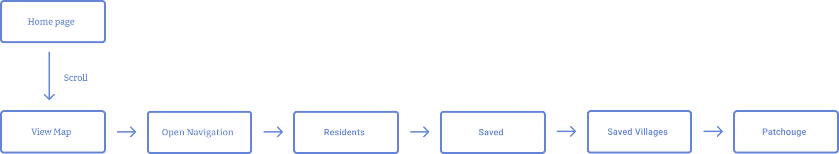
This user flow has a user scroll through the home page, interact with the map and then go through navigation to view saved villages and picking one.
The final designs combine outlines and the wave motif to help highlight some the key features of Brookhaven. It allows users to feel that they are navigating the website with purpose. As well as easy access information that will help them enjoy their time in Brookhaven. Also the first saved page was removed as it is just better for navigation for the user.
After various feedback and creating more unified elements, I created a style guide to create proper hierarchy in typography and treatments to be used for icons and other elements.

The prototype was done in figma and screen recorded. Explore down below with figma link by hovering and clicking over some titles and buttons for some nice surprises to improve the overall enjoyment.
I felt that overall i was able to adhere to design standards while experimenting with some design elements that would make it fun for users. The redesign really captured the feeling of being in Brookhaven. If I had more time I would have expanded on the interactivity of the website. Check out my Figma File and Process Deck below.